!date
first things first, [here's the link to the data] (http://former.vancouver.ca/projects/burrard/statistics.htm#Measuring).
second things second.
mv /home/christopher/Downloads/stats_burrard_bridge_2009_2010.xls ./
mv /home/christopher/Downloads/vancouver_bridge_stats\ -\ Sheet1.csv ./vancouver_bridge_stats.csv
ls
import pandas as pd
bridge_stats = pd.read_csv('vancouver_bridge_stats.csv')
bridge_stats.head()
sick nasty, it already filled in all the empty values with NaN
alright so first off, the things that set me off about this dataset was that a bunch of people were crossing the bridge but not going back home. watch.
comma_cols = bridge_stats.columns[2:]
def need_to_replace_some_commas():
    for i in comma_cols:
        bridge_stats[i] = bridge_stats[i].str.replace(',','')

# don't write functions at home like this kids
need_to_replace_some_commas()
bridge_stats.head()
bridge_stats[30:40]
that cheeky fucking function worked.
num_cols = comma_cols # so i remember i'm doing
def it_all_floats_on():
    for i in num_cols:
        bridge_stats[i] = bridge_stats[i].astype(float)
it_all_floats_on() # crafting lazy functions isn't modest. it's just lazy
bridge_stats['northbound vehicles'][:10].dtype
ayyy i'm that dude writing just the laziest code
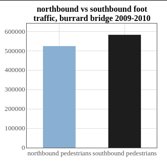
bridge_stats['northbound pedestrians'].sum()
bridge_stats['southbound pedestrians'].sum()
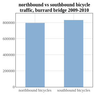
[bridge_stats['northbound bicycles'].sum(), bridge_stats['southbound bicycles'].sum()]
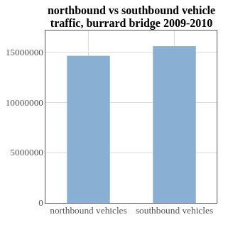
[bridge_stats['northbound vehicles'].sum(),bridge_stats['southbound vehicles'].sum()]
look at my no-manners-no-intro-looking-assssssuming that you'll follow
right along with what I'm doing here. you probably won't. that's okay. also I don't capitilize much anymore. it's a whole keystroke that I'm not willing to even stretch for, and explaining that plus capitilizing my "I"'s is so much extra work I barely even want to talk about it but there ya go. I did it.
FOR THE CUSSIN' CONTEXT
welcome back. been awhile. where have you been? I've been right here. literally the entire time.

what's all that mumbo jumbo above?
well. that's data my friends. data on data on data.
lemme explain myself
I heard the best way to learn something is by doing it. Someone smart from the mirror told me that.
So I looked up datasets I could mess around with. I looked all over, up and down, left and right, something that seemed interesting enough to play with and
BOOM
I found one. This one is data collected on people crossing a bridge in Vancouver, mainly to measure bicycle and pedestrian traffic. To see if they ran into each other or whatever. It's all on the site. Go click on that link. Don't make me explain it.
Anyway it's got my three favorite things.
1)Bikes.
2)Vancouver.
3)And bridges.
I made that last one up, but I do love the first two. And bridges are pretty cool if you're into that sort of thing.
!(vancouver)[vancouver.jpg]
Look at that place.
LOOK AT IT WOULD YA? GORGEOUS RIGHT?
geez settle down and keep reading.
also I don't know which bridge it is up there. that would be interesting to find out.
anyways I was finessing around with the data in Excel because Excel is cool and it can be abbreviated as 'XL' and that's cool too plus it's a pretty easy-to-use-ultra-powerful-data-tool. so keep that in mind.
AND THAT'S WHEN I NOTICED SOMETHING
I noticed that more people travel Southbound than they do Northbound on the bridge, in every category. And not even by a lot. It's like, a teensy eeensy bit everyday and the totals are even an eeensy bit as well.
apparently south is cooler than north in Vancouver.
I mean like...do they stay at a friends house? Do they take another way back? Do they swim?
(There are days that data wasn't collected, they all could have snuck back on those days too. sneaky peeps)
Finding out the real reason why more people end up south of the bridge than the north would probably take longer (and would be victim to a bad game of thrones joke, which I don't watch but do you) and I wanted to do a comprehensive data mine to data visualization that I thought wouldn't take me all night.
I could have showed you all of that with the code and the spreadsheet and it would have been like...
uh yeah...cool numbers dude
so instead I got all graphical and made some sick nasty sweet graphics. because everyone loves beautiful graphics.
I actually wrote the graphs in javascript but then realized it might be too hard to copy all that code over, URLs and everything and also I couldn't figure out for the life of me why I couldn't change the color of the second bar on the second and third graphs ...
so yeah.. whatever I guess. And the pictures work out.
WHAT YOU JUST JUST GOT INTO BY READING THIS
I decided to do another challenge. One of my own making. The #100DaysOfBullroar doesn't really cut it. I will shameless use the popular ones to get people to read my posts though.
if you want to see where I got the data from the link is at the top and the original file is in this repo on github. so be a sleauth and go find it.
alright. go away now.